Water is the hardest of these subjects, because it cannot be drawn. The moment you start describing individual waves it stops moving and turns into a relief map.
What you paint instead is the light on it, and the colour underneath it, and you let the shapes stay slightly unresolved. Three pieces where that is the whole problem.
African Beach
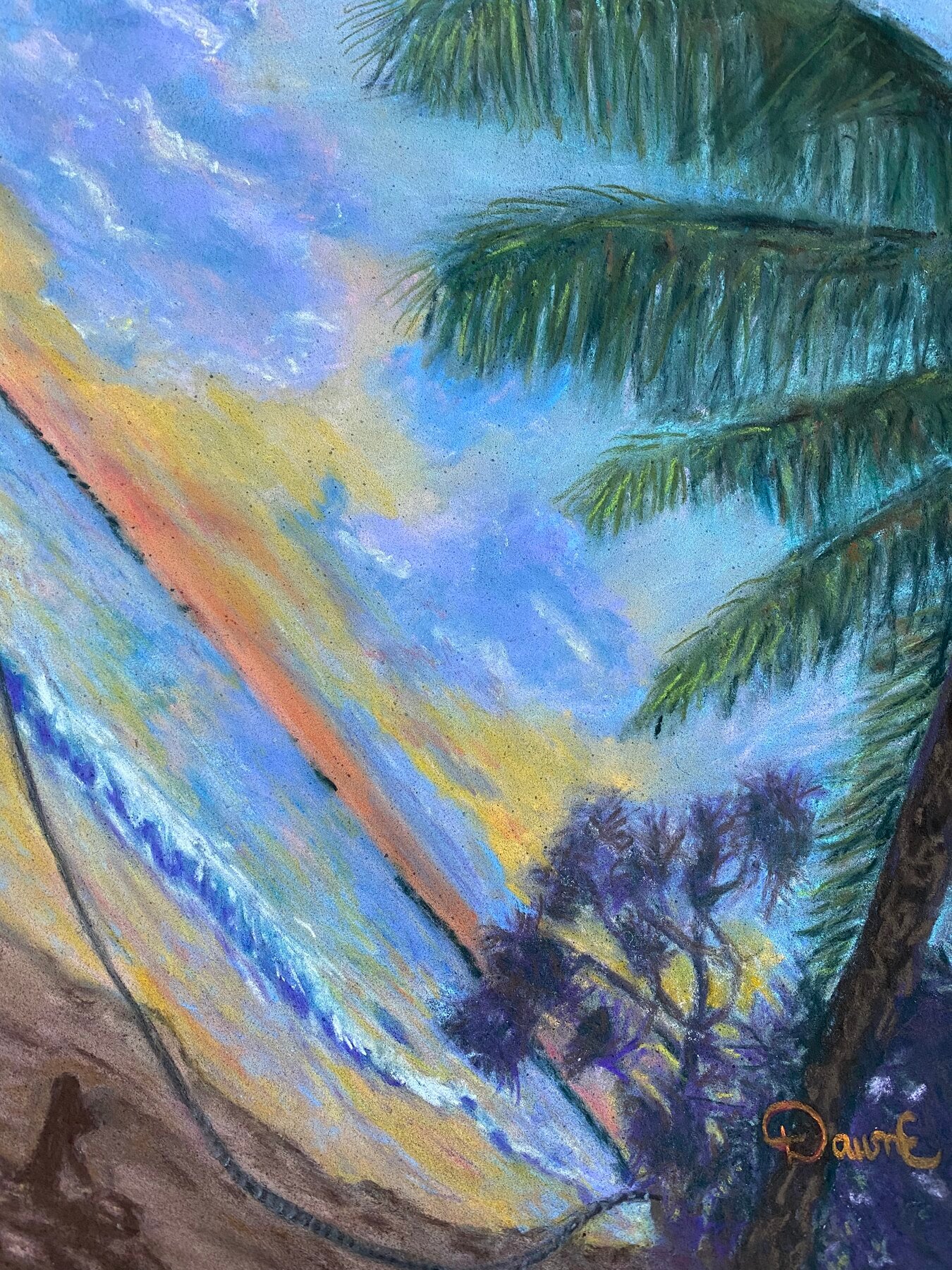
A wave caught mid-break, turquoise going white along the crest, with palm fronds leaning in from the top right and a coral streak through the sky above. It is a tall painting rather than a wide one, which is unusual for a seascape and is the reason it works. The vertical format makes the wave feel like it is coming towards you rather than passing across.
The green of the fronds is the coldest thing in the picture and it is doing a job. It keeps the coral in the sky from going sweet.
Beach Shack
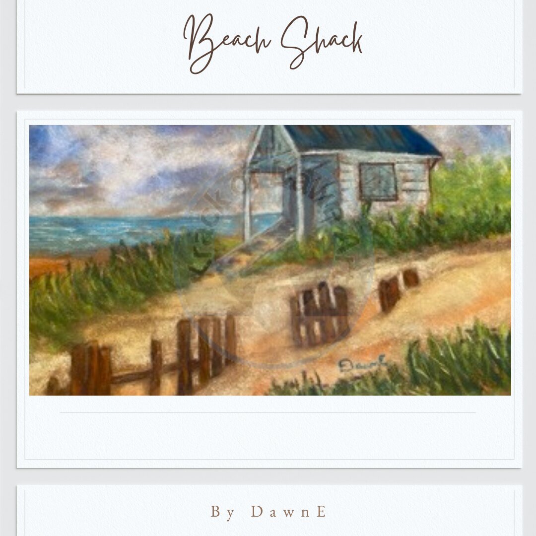
Here the water is the quietest part. A cabin stands on a dune, weathered to that blue-grey that painted timber goes when the salt has been at it for a decade, with fence posts wandering off through the sand and the sea sitting flat behind.
The sand is where the work is. It looks like one colour and it is not: warm ochre where the sun is on it, mauve in the hollows, and a cool grey along the shadow of the dune. Paint sand as sand-colour and it goes dead every time.
Chevy at The Beach
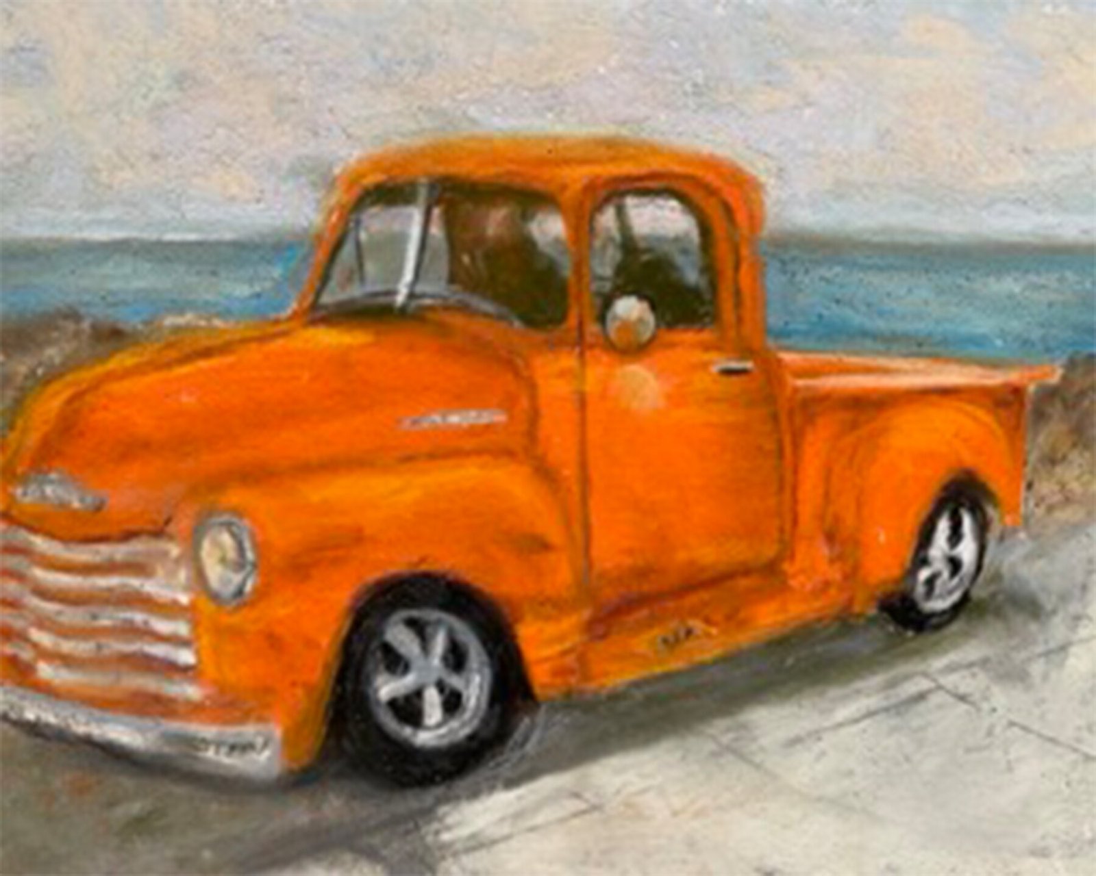
The odd one out, and my favourite of the three for that reason. An orange truck parked where the sand gives way to hard ground, ocean flat behind, sky washed pale the way it goes in the middle of a bright day.
The whole painting is built to serve that orange. The sea is deliberately understated, the sky is nearly empty, and neither is allowed to be interesting. At 5 × 7 there is no room for anything that is not earning its place.
One original of each. Prints are available where the original has already gone.
The full collection is in the gallery, and there is more on how the pigment behaves in why I work in soft pastel.
— DawnE